I recently purchased a responsive web template but wanted to include a Google Map of the website business being promoted. I wanted the Google Map to be responsive just like the site. Here’s how to do it in a few steps.
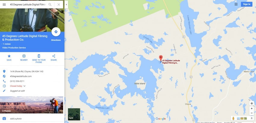
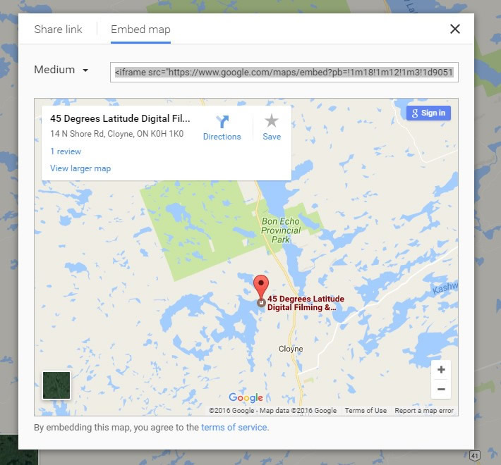
Go to Google Maps and search for the business and position the map the way you want it (see image above). To the left you will find a blue ‘share’ icon. Click on the icon to reveal the panel below. Notice I selected the ‘Embed map’ tab at the top. Again, position the business location as you wish it to appear on your site. It works best to center your business. You will need the iframe source code as it appears so keep your Google Map open.
Copy the iframe source code completely and paste it below where shown.
<style>
    .google-maps {
        position: relative;
        padding-bottom: 50%; // This is the aspect ratio
        height: 0;
        overflow: hidden;
    }
    .google-maps iframe {
        position: absolute;
        top: 0;
        left: 0;
        width: 100% !important;
        height: 100% !important;
    }
</style>

<div class="google-maps">
    <iframe src="https://www.google.com/maps/embed?pb=!1m14!1m12!1m3!1d7098.94326104394!2d78.0430654485247!3d27.172909818538997!2m3!1f0!2f0!3f0!3m2!1i1024!2i768!4f13.1!5e0!3m2!1sen!2s!4v1385710909804" width="600" height="450" frameborder="0" style="border:0"></iframe>
</div>
Next, copy the code above and insert it into your page where you wish the Google Map to appear.
One other adjustment is the upper blue line of code which I set at 50%. This is the aspect ratio. You can change this figure to your liking for example, if you wish to decrease the vertical dimension of the map, decrease the 50% to say, 40%. If you wish a wish to increase the map’s vertical dimension increase this to 75% or so. Tweak to your liking.
Source: Thanks to Amit Agarwal for the code.
Viola! That should do it. Check the map on a smartphone, tablet or desktop. It should work perfectly. Good luck!